Visualization Techniques and Practice
16.4K views | +0 today
Follow
Visualization Techniques and Practice
How to use visualization techniques for nonprofits in areas like data analysis, learning, facilitation, and innovation
Curated by Beth Kanter
Your new post is loading...
Rescooped by Beth Kanter from visual data
Scoop.it!

How to Make an Infographic Worth a Thousand Words

How to Make an Infographic Worth a Thousand Words | Visualization Techniques and Practice | Scoop.it

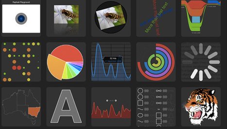
As the old saying goes about pictures being "worth a thousand words," so goes the story about infographics.


Infographics are a compelling way to represent complex information quickly and clearly. In an infographic, visual symbols and numbers are used with colors, fonts, and labels to make the data more useful. With the flood of information and exponential data points, it is imperative to focus people's attention on not just the valuable data, but the implications as well.

Storytelling is using a linear narrative to guide people- as the creative and performance marketing communities work together to make sense of data, we must not squander the opportunity that this format provides. We need to create meaningful infographics that minimize information anxiety by conveying the perspective in the most effective manner. Agencies are tasked with providing creative expressions that connect target audiences with meaningful content -- and infographics are by no means any different.

Visit the complete article to learn more about the fundamental factors that contribute to successful infographics:..


Via Lauren Moss
No comment yet.
Rescooped by Beth Kanter from visual data
Scoop.it!

The top 20 data visualisation tools

The top 20 data visualisation tools | Visualization Techniques and Practice | Scoop.it

From simple charts to complex maps and infographics, Brian Suda's round-up of the best – and mostly free – tools has everything you need to bring your data to life...

A common question is how to get started with data visualisations. Beyond following blogs, you need to practice – and to practice, you need to understand the tools available. In this article, get introduced to 20 different tools for creating visualisations: from simple charts to complex graphs, maps and infographics. Almost everything here is available for free, and \you may have installed already...


Via Lauren Moss
Randy Rebman's curator insight, January 28, 2013 12:33 PM

This looks like it might be a good source for integrating infographics into the classroom.