Must Design
75.6K views | +0 today
Must Design
Design Is Revolutionary
Your new post is loading...
Scooped by Martin (Marty) Smith
Scoop.it!

Best Website Design May be NO DESIGN

Best Website Design May be NO DESIGN | Must Design | Scoop.it

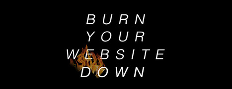
Burn Down Your Website
Websites are cool and a great marketing aid...until they aren't. If the line of when they aren't isn't behind us we are approaching it. What is a "website" when we share posts on Medium, Scoop.it and GPlus?

 Feels like the idea of a website as a MUST GO HERE to interact with our marketing message is hopeless out of touch. Even when we do GO to a website what are we looking for? 

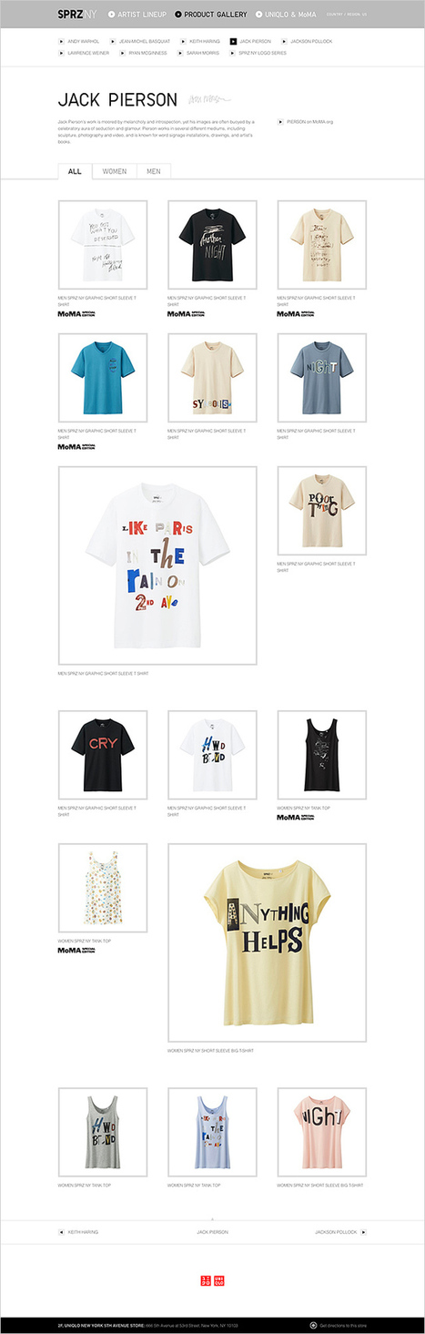
FUN, ENGAGEMENT and RELEVANCE.

The typical talking to yourself about yourself marketing that most flog online feels more than dead, it feels dangerous. Google's vote is clear - if your content doesn't create an increasing number of likes, loves, shares and loyalty your website is screwed, blued and tattooed.

Especially if someone in your immediate competitive sphere knows how to THROW DOWN, create community and MOVEMENTS instead of the usual solipsistic crap. Keep talking to yourself while someone else in your business vertical is hosting a party and you will be waxed.

Waxed because what really matters NOW is LOVE. If your win hearts and minds because you are honestly all in and listening hard you get to "win". If you are amazing you create blue oceans and uncontested competitive space for however long the ride lasts. Talking about FUN.

This Haiku Deck discusses the death of tactical web marketing. You can't out email market my team and I, or not for very long. We've been doing this crazy biz since 1999. You can gain an inch and we are likely to come back and take a mile.

 https://shar.es/12ekPU

No comment yet.
Scooped by Martin (Marty) Smith
Scoop.it!

Who Did MoMA Hire To Create Their Web Store? Yugo Nakamura

Who Did MoMA Hire To Create Their Web Store? Yugo Nakamura | Must Design | Scoop.it

Japanese web designer Yugo Nakamura has created some cool sites. Great clean lines, white backgrounds, splashing of color, movement both real and implied reminds me of Haring, Warhol and de Kooning. #toogood #webdesgin

Martin (Marty) Smith's insight:

add your insight...

No comment yet.
Scooped by Martin (Marty) Smith
Scoop.it!

Best-in-Class eCommerce Web Designs via @conversioniq

Best-in-Class eCommerce Web Designs via @conversioniq | Must Design | Scoop.it

Best In Class From Conversion IQ
The other day I complained about "pretty picture' ecommerce sites that make conversion harder. So much of ecom is ditch digging. Ditch digging to make sure you have things such as:

* Email subscription form (prefer presence to popunders).
* Clearly ECOM - looks like a store with things to sell not content to read.
* Social (easy to find theirs and easy to contribute).
* Content Curation from social / comments / reviews (should feel like a party with people who share love / interests).

* Offers, deadlines and a sense of time (of the year today is Columbus Day for example).

These examples from Conversion IQ are closer to "ditch digging" ecommerce websites. Conversion either BUYING or into a list are easier, more clear and so these designs make more money than the pretty picture websites I shared last (http://sco.lt/4ijZIH ),

No comment yet.
Scooped by Martin (Marty) Smith
Scoop.it!

30 Beautiful and Creative Ecommerce Website Designs – Shopify

30 Beautiful and Creative Ecommerce Website Designs – Shopify | Must Design | Scoop.it

A blog about ecommerce marketing, running an online business and updates to Shopify's ecommerce community.

Marty Note
Ecommerce is hard to make "BEAUTIFUL". The conventions are well established now such as hero, underneath or to the right of the hero is a line of products, nav leads to category pages then to product pages, big search box and so on.

Here are 30 cool takes on convention that don't spill conversions all over the floor, the danger of modifying ecommerce convention, but do create intelligent and NEW feeling ecom web design.

My favorite is Norwegian Rain because their hero tells such a amazing story with so few words. Very difficult to do a group shot like that without looking too exclusive. Like a club that would never have YOU (the visitor) for a member.


I don't get that feel from their image and design. Very cool and NOTHING I would have considered before seeing that a group shot of that magnitude can be accomplished.

Norwegian Rain
No comment yet.