With 22,000+ views SEO for Web Designers blew up thanks to a defined tribal audiences, advocates and luck. Discover tips on how to blow your content up too.
Get Started for FREE
Sign up with Facebook Sign up with X
I don't have a Facebook or a X account


 Your new post is loading... Your new post is loading...
With 22,000+ views SEO for Web Designers blew up thanks to a defined tribal audiences, advocates and luck. Discover tips on how to blow your content up too. 
No comment yet.
Sign up to comment
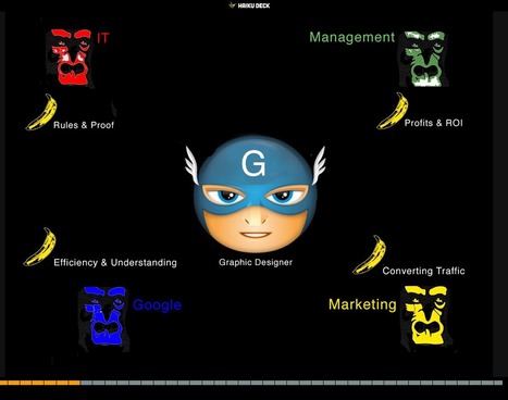
17,162 People Later * Graphic designers are heroes under siege by many groups. * Set REALISTIC expectations.
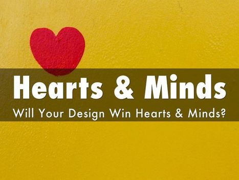
Web Designer SEO * Learn what is MIST vs what is Gorilla. * Design to Win Hearts, Minds and Loyalty.
Beautiful Unusual Navigation Designs for Inspiration. Selection of Awwwards websites with a strong presence of unusual navigation. An effective navigation design is crucial for a website
Martin (Marty) Smith's insight:
Navigation feels old and moldy. There are few things MORE critical than navigation. We've moved from left nav sitting firmly in the "golden triangle" to horizontal top navigation.

BOUTELOUP Jean-Paul's curator insight,
June 27, 2014 2:21 AM
Merci ! il est bon de repenser aussi le webdesign pour une nouvelle expérience utilisateur

Yesterday an article on Medium, Snowfallen, caught my eye. It's about a technique for presenting longform writing online, by embellishing it with integrated
Martin (Marty) Smith's insight:
Not sure how I feel about "snowfall" design. My favorite is the Buzzfeed History of Pong. My concerns are:
|

From
yoast

Canonical URLs Explained * Use of blockquotes & rel=canonical tags.
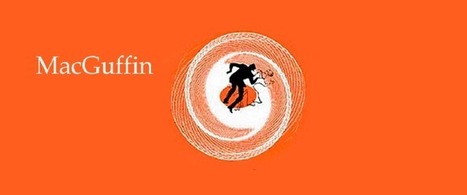
Website MacGuffins are ideas such as Free Shipping whose absence hurts more than their presence helps. What are your website's MacGuffins?

Check out the hottest web UI patterns used by Pinterest, Facebook, Twitter, Kickstarter, AirBnB, Tinder, and more. 5. Create an ASK (such as Join our Ambassador Group). 6. Rinse and Repeat. Via Jakarta Web Developer

Seasonality creates relevance & relevance creates community. Every website's hero should change at least 4x a year: Summer, Fall, Winter & Spring.
Martin (Marty) Smith's insight:
This Curagami post shares our favorite Top 10 Summer Web Designs in the hope people will VOTE for theirs and share ones we missed. The post also shares a link from @Mike_Alton about the magic of List.ly (the Digg-like tool that runs the social voting engine that's free and easy to embed).
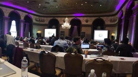
Last week, Jeremy Osborn, Academic Director for Aquent Gymnasium, had the chance to attend the Artifact Conference. Here are his key takeaways.
|