Presentation Tools
195.1K views | +0 today
Follow
Presentation Tools
Tools and services to deliver your presentations: online and off
Curated by Robin Good
Your new post is loading...
Scooped by Robin Good
Scoop.it!

Generate Professional Charts and Diagrams From Your Data with Vizalizer

Generate Professional Charts and Diagrams From Your Data with Vizalizer | Presentation Tools | Scoop.it


Robin Good's insight:


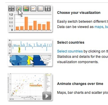
Vizalizer is a web app which allows you to create professional-looking graphs and charts out of your own data.


From standard bar graphs to 3D pies, Vizalizer offers already 18 types of graphs you can create by simply a) selecting a ready-made template and b) editing the data inside via a simple dialog box.


The final graph created can be easily exported and downloaded as a high-quality PDF.


Excellent tool to show your data in simple but elegant and effective ways, especially when you want to slice and dice the same data-set in different ways.


Free plan available. It includes 10 charts per month, some ads, Vizalizer logo and no PDF downloading feature. The Pro plan starts at $9.99/mo for unlimited charts, no logo, and PDF download.


Try it out now: http://vizalizer.co/


Pricing: http://vizalizer.co/pricing/


To see the different types of charts available scroll down to the bottom of this page: http://vizalizer.co/index/


Alfredo Corell's curator insight, July 8, 2013 3:17 PM

Free access is only for 10 charts/month and withour pdf loading tool.

María Asunción Martínez Mayoral's curator insight, July 8, 2013 7:16 PM

Interesante perspectiva: "Data as knowledge. Users as influenzers"

Estelle Metayer's curator insight, January 5, 2014 4:00 AM

Great tool for outstanding end products

Scooped by Robin Good
Scoop.it!

Statistical Graphs: Create Interactive Charts and Maps with StatPlanet and StatTrends (Win)

Statistical Graphs: Create Interactive Charts and Maps with StatPlanet and StatTrends (Win) | Presentation Tools | Scoop.it

Robin Good: StatSilk offers a set of free downloadable software tools to create professional-looking stat and trend charts.


StatPlanet can be used to create anything from basic interactive maps to advanced infographics.


StatTrends is tailored to create interactive graphs and charts.


Key features include: 


-> Multiple graphing and charting types


-> Select countries by clicking on them in the world map or country selection window. Statistics and details for the country selected are displayed inside popups and visualization components.


-> Animate changes over time


-> Zoom into map regions


-> Hide or reveal details - Change the level of detail by hiding or revealing interface components, country names or statistics.


-> Customize the colors and value ranges of maps

and graphs.


-> Export maps for use in other applications or publications.


Examples: http://www.statsilk.com/examples 


Try free web-demo here: http://www.statsilk.com/software/stattrends 


Features: http://www.statsilk.com/features 

and here: http://www.statsilk.com/features#components 

Downloads: http://www.statsilk.com/downloads (Win only)


Find out more: http://www.statsilk.com/ 

No comment yet.
Scooped by Robin Good
Scoop.it!

Create Professional Business Graphs from Your Database Data with Polychart

Create Professional Business Graphs from Your Database Data with Polychart | Presentation Tools | Scoop.it


Robin Good's insight:


Polychart is a web-based app which allows you to connect to your database data (MySQL, SalesForce, PostgreSQL, InfoBright) and to generate professional-looking charts and graphs that can be edited interactively and that can be extensively customized.


As far as source data is concerned, you can connect to any online MySQL, Salesforce, InfoBright or PostgreSQL database repository and connect directly to the existing data.


Once you have connected your database you can select which fields you want to be visualized and you can customize the type of chart (bar, line, scatter, area, tile and spline) and the individual elements that make it up.


Your final chart visualization can be easily exported to a PDF, PowerPoint, vector (.SVG) or image (.PNG) file.


Free to use.


Find out more: https://www.polychart.com/


No comment yet.