


If you've ever struggled with what visualization to create to best show the data you have, The Data Visualization Catalogue might provide just the help you
Get Started for FREE
Sign up with Facebook Sign up with X
I don't have a Facebook or a X account


 Your new post is loading...
 Your new post is loading...
Your new post is loading...
If you've ever struggled with what visualization to create to best show the data you have, The Data Visualization Catalogue might provide just the help you
Robin Good's insight:
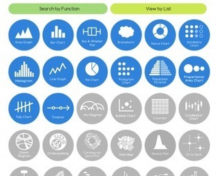
The Data Visualisation Catalogue is an on-going project developed by Severino Ribecca which attempts to index and catalogue all of the data visualization approaches available, in order to help journalists, designers and professional communicators identify more easily the type of data visualization most appropriate for their needs. . In the Catalogue there are now over 50 different data visualization approaches that have been identified, and about a third of them have also been documented with a basic description, visual examples, relevant tags to associate it with their possibe best uses, variations, and with a list of alternative tools available to create that type of data chart. . You can browse the catalogue also by using the "Search by Function" which is designed to aid in choosing the appropiate data visualization approach based on the specific communication need at hand, or with the "View by List" approach, which organizes dataviz methods by types. . My comment: Excellent resource for visual communicators of all kinds as it helps you see the great variety of dataviz approaches available. It makes it easier to identify and select relevant solutions according to needs and use. . Check it out: http://blog.visual.ly/the-data-visualization-catalogue/ . . Hat Tip to @LelioSimi 

"Weave (BETA 1.0) is a new web-based visualization platform designed to enable visualization of any available data by anyone for any purpose. Weave is an application development platform supporting multiple levels of user proficiency — novice to advanced — as well as the ability to integrate, disseminate and visualize data at "nested" levels of geography." Source code also available on GitHub More info: http://flowingdata.com/2012/02/07/weave-for-visualization-development/
|
Robin Good's insight:
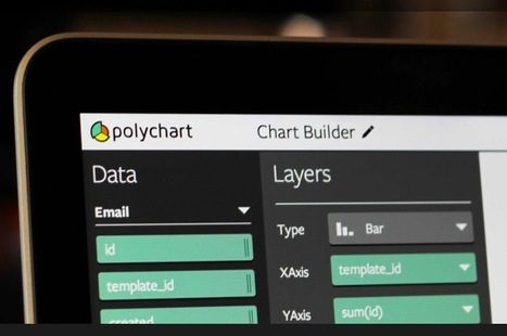
Polychart is a web-based app which allows you to connect to your database data (MySQL, SalesForce, PostgreSQL, InfoBright) and to generate professional-looking charts and graphs that can be edited interactively and that can be extensively customized. As far as source data is concerned, you can connect to any online MySQL, Salesforce, InfoBright or PostgreSQL database repository and connect directly to the existing data. Once you have connected your database you can select which fields you want to be visualized and you can customize the type of chart (bar, line, scatter, area, tile and spline) and the individual elements that make it up. Your final chart visualization can be easily exported to a PDF, PowerPoint, vector (.SVG) or image (.PNG) file. Free to use. Find out more: https://www.polychart.com/
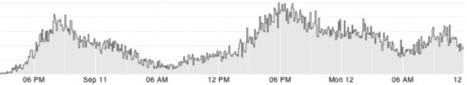
Cube is an open-source system for visualizing time series data, built on MongoDB, Node and D3. If you send Cube timestamped events (with optional structured data), you can easily build realtime visualizations of aggregate metrics for internal dashboards. (Cube has a handful of chart types that you can assemble into dashboards.) For example, you might use Cube to monitor traffic to your website, counting the number of requests in 5-minute intervals. Video demo (60"): http://www.youtube.com/watch?feature=player_embedded&v=oq0qEu1dDdA Documentation: https://github.com/square/cube/wiki Source code: https://github.com/square/cube Find out more: http://square.github.com/cube/
|


A great collection of data visualisation tools, categorised by the characteristics of the data you want to show.
Rappresentare: raccontare la realtà in modo tale da attrarre in modo efficace l'attenzione del nostro interlocutore/lettore. In una società iperconnessa e dialogica, fondamentale competenza.